Example visualizations using the euroleague data
Source:vignettes/euroleague-visualizations.Rmd
euroleague-visualizations.RmdIntro
This page demonstrates quick exploratory charts you can build with
the euroleague_basketball dataset.
Peek at the data
head(EuroleagueBasketball::euroleague_basketball[, .(Team, Country, `Home city`, Arena, Capacity,
                                                     FinalFour_Appearances, Titles_Won)])
#> Key: <Team>
#>                         Team              Country       Home city
#>                       <char>               <char>          <char>
#> 1:              Anadolu Efes               Turkey        Istanbul
#> 2:                 Barcelona                Spain       Barcelona
#> 3:                  Baskonia                Spain Vitoria-Gasteiz
#> 4:             Bayern Munich              Germany          Munich
#> 5: Crvena zvezda Meridianbet               Serbia        Belgrade
#> 6:          Dubai Basketball United Arab Emirates           Dubai
#>                            Arena Capacity FinalFour_Appearances Titles_Won
#>                           <char>   <char>                <char>     <char>
#> 1: Basketball Development Center    10000                     5          2
#> 2:               Palau Blaugrana     7585                     0          0
#> 3:                   Buesa Arena    15431                     0          0
#> 4:                    SAP Garden    11500                     0          0
#> 5:                Belgrade Arena    18386                     0          0
#> 6:               Coca-Cola Arena    17000                     0          0
Titles vs Final Four Appearances
# Convert to data.table
dt <- as.data.table(euroleague_basketball)

# Convert columns to numeric
dt[, Titles_Won_num := as.numeric(Titles_Won)]
dt[, FinalFour_num := as.numeric(FinalFour_Appearances)]

labels <- dt[FinalFour_Appearances > 0]

# Plot
ggplot(dt, aes(x = Titles_Won_num, y = FinalFour_num)) +


    geom_point(color = "#295466", size = 3) +

    geom_text_repel(
        data = labels,
        aes(label = Team),
        size = 3
    ) +

    labs(
        title = "EuroLeague Titles vs Final Four Appearances",
        x = "Titles Won",
        y = "Final Four Appearances"
     ) +

    theme_minimal(base_family = "Candara") +

    theme(
        panel.grid.major = element_line(linewidth = 0.45, color = "grey85", lineend = "round"),
        panel.grid.minor = element_line(
            linewidth = 0.35,
            color = "grey85",
            linetype = "dashed",
            lineend = "round"
        ),

        plot.margin = margin(20, 20, 20, 20),

        plot.background = element_rect(fill = "grey93", color = NA)
    )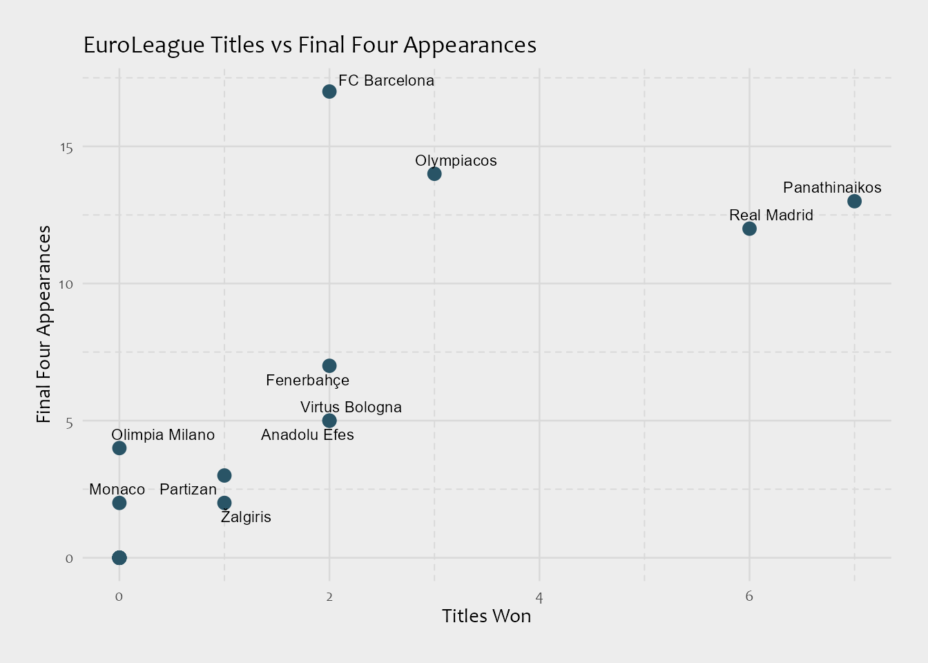
Takeaway: Teams with many Final Four appearances aren’t always those with the most titles. For example, some teams are consistent contenders but rarely convert appearances into championships.
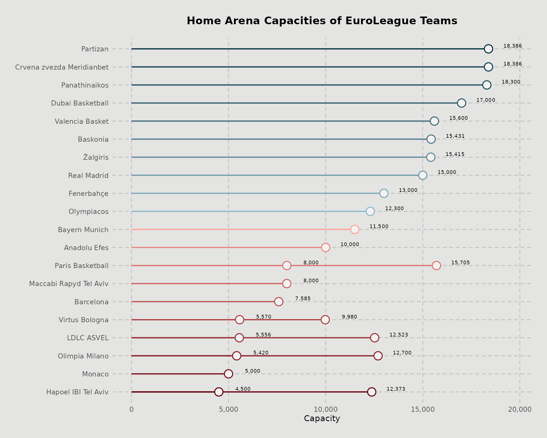
EuroLeague Arena Capacities
# Convert to data.table
df <- as.data.table(euroleague_basketball)

df1 <- df[, .(Team, Arena, Capacity)]

caps_list <- df1$Capacity |>
    str_extract_all("\\d{1,3}(?:[.,]\\d{3})*")

df_plot <- data.table(
    Team     = rep(df1$Team, caps_list |> lengths()),
    Capacity = caps_list |> unlist()
)

df_plot[, Capacity_num := Capacity |> str_remove_all("[^0-9]") |> as.integer()]


# sort rows by numeric capacity (ascending)
setorder(df_plot, Capacity_num)

# lock that order into the y-axis (and colors if you map by Team)
df_plot[, Team := factor(Team, levels = unique(Team))]


col = c('#033342', '#124150', '#224f5e', '#325d6d',
        '#426b7b', '#527a8b', '#62899a', '#7199aa',
        '#81a8ba', '#91b8cb', '#ffa49c', '#e88982', '#db7771',
        '#cd6560', '#bf5350', '#ae4343', '#9d3336',
        '#8c2229', '#7a121c', '#67000e')

# plot -------

ggplot(df_plot, aes(x = Capacity_num, y = Team)) +

    geom_segment(
        aes(x = 0, xend = Capacity_num, y = Team, yend = Team, color = Team),
        linewidth = .75
    ) +

    geom_point(
        aes(color = Team),
        shape = 21,
        stroke = .95,
        size = 4.5,
        fill = "grey95",
    ) +

    geom_text(
        aes(label = scales::comma(Capacity_num)),
        nudge_x = 1250,
        size = 2.5,
        vjust = -0.35
    ) +

    scale_color_manual(
        values = rev(col)
    ) +

     scale_x_continuous(labels = scales::comma) +

    labs(
        title = "Home Arena Capacities of EuroLeague Teams",
        x = "Capacity",
        y = NULL,
        fill = "Team"
    ) +

    theme_minimal(base_family = "Candara") +

    theme(

        axis.title.y = element_blank(),

        axis.title.x = element_text(size = 11),

        axis.text = element_text(size = 9),

        legend.position = "none",

        panel.grid.major = element_line(color = "grey75", linetype = "dashed", lineend = "round"),
        panel.grid.minor = element_blank(),

        plot.title = element_markdown(size = 14, face = "bold", hjust = 0.5, margin = margin(t = 2, b = 15)),

        plot.margin = margin(20, 20, 20, 20),

        plot.background = element_rect(fill = "#e4e4e3", color = NA)

    )
#> Ignoring unknown labels:
#> • fill : "Team"